Tuesday, May 17, 2016

S'More Cake Please!


I had the pleasure of creating graphics for a Camp themed first Birthday party. After I had completed a logo for the invitation, we used it for bottle labels, a banner and envelope stickers that sealed the invites. We even had t-shirts made with 'Park Ranger' for Dad and 'Camp Director' for Mom. 
To keep with the theme, party favours were s'more cake pops provided by Cake Pops by Jess. They were delicious! Paper bags were provided for the kids so that they could make their own trail mix, and lake water to help stay hydrated. It was a fun theme and quite fitting for the 1 year old who loves the outdoors.


Monday, April 6, 2015

Hear Yee Here He

I just wanted to share a birth announcement I did last year for my close friend. Photography and layout done my yours truly. It's hard not to take an adorable photo of this baby. 


Showering Baby

I had the privilege of hosting a baby shower for my dearest friend and her baby boy. She did not want any specific theme, so I kept it simple; blue. I designed my own patterns for a banner and paper cones to serve snacks in, which added a personal touch. I also designed my own templates for any print outs we used for games.
I created favour tags for the adorable rattle cake-pops supplied by Cake Pops by Jess, who also made the beautiful cake and delicious cookies. It was a fun day and my friend really appreciated all the attention to detail. 


Friday, May 2, 2014

New Shoes to Fill

I am so excited for my best friend and her husband who are expecting their first child! Rather than the typical ultrasound photo to announce the news, we had the idea to use shoes, a step in a more creative direction. We left the original photo in black and white, and when she was ready to announce the baby's gender, we let the shoes speak for themselves. 


Monday, December 3, 2012

Happy Holidays


A Christmas card I photographed and designed for Jesse, Dominique, and Tegan.

Thursday, August 16, 2012

Paws for a Post

A recent addition to the 'poor Odie' series. I created this post to encourage my social network of friends to donate to the BCSPCA Paws for a Cause walk that Odie and I take part in every year. 

Sunday, August 12, 2012

Tough Logo


This was my execution of a logo for a Tough Mudder Team,"the Mud Flaps". 

Sunday, April 15, 2012

Time for tea?

This photo is of myself on Halloween dressed as the Mad Hatter. It was a fun costume to put together, it allowed me to be creative and there are so many components to it that you don't realize until you study the character. With all of it put together I was only a little 'Mad' that Halloween only lasts for one night.

Friday, April 6, 2012

Dear Pen, I miss you. -Paper


A social network friend of mine had posted that she was tired of receiving mail that was printed from a default program asking for her bill payments, or flyers advertising the latest discounts. She was inviting people to become her pen pal. The last time I had a pen pal was when I was waiting for dial-up to learn how to work electronic mail. I took this invitation as a chance to tell a fun story without the safety net of auto correct.

Tuesday, April 3, 2012

Bon Voyage!

One of my co-workers is moving on to another workplace. He is loves to travel so for his going away card, I had the idea to make it an airplane boarding pass. Since there is not much room to sign notes on the boarding pass itself, I made luggage tags that we can write well wishes on. The dog is an inside joke. 


Friday, November 25, 2011

An Obvious Issue


                    Most people are unaware of how serious nut and peanut and allergies can be and how easily someone can               become victim to their allergy through cross contamination. 

Let the games continue


Teaser posters for Cin-e Games Part II


Saturday, October 1, 2011

Manager Days


A general manager came to me with an idea for 'Manager Days'. He wanted to allow his staff members to book a time to sit down and speak with him about anything regarding the job and such. So, to advertise to the staff, I put together a series of posters for him and his managers to put around the building. They would be able to use the posters for different days and perhaps just add the times available at the bottom of the poster. I also put together business card ideas and a possible layout for a mail-out. Still works in progress.


Tuesday, August 30, 2011

Creating a Look


This was an assignment where we were to re-design 3 pages of an existing magazine. 
I chose to modernize a women's snowboard magazine, which was a challenge. 
Originally I felt that the magazine was too busy and felt cluttered so I did my best to
 simplify the pages. 

Softball Logos


Wednesday, July 6, 2011

Summer Event Posters


The softball poster is an homage to the Bad Teacher movie poster seen below. 

Wednesday, March 23, 2011

a lost Wall-e

Usability is a big part of design. I had an Information Design class that I really enjoyed. It allowed me to look at my ideas not only as the designer, but I had to put myself in the shoes of the user to make sure that my end-to-end experience was complete and accurate.
In this small assignment, we were asked to walk from our classroom to a restaurant down the street in the mind of a particular user. We drew names from a hat and I was excited to find that I pulled the Disney and Pixar character, Wall-e. So, I channeled one of my favorite characters and was on my way. I kept in mind that Wall-e wouldn’t know much about the world around him because the Earth he knew was mounds of garbage and solitude. I kept it simple, showed him things that he'd be familiar with (i.e. fire extinguisher) and used it all to create a map for him so that he would make it to Eve in time for dinner.Again, it wasn't a big assignment as far as marks go, but I enjoyed it.


*The light at the cross walk was censored so that when Wall-e would cruise by,it would make a noise because it was just at his height. That noise would let Wall-e know he was on the right track. Then, he would feel the bumpy grates in the sidewalk as he rolled overtop of them.

No Excuses

This was another class project that I completed. I can’t exactly be sure of what the assignment specifics were, but we were allowed to pick a Canadian organization. I chose the Canadian Blood Services because at the time, I had never donated blood. A couple of my friends had, and encouraged me to do so over the years. I mean, you not only had a chance to help save lives, but you got free cookies!
For this campaign that I came up with, I focused on the fact that the only things really keeping people from donating is fear and excuses. I even found on the Canadian Blood Services website the top 10. So after some sketching and filtering through ideas, I presented these 3 as my final product.


Since the completion of this project, I have become a blood donor. My only mistake was taking a friend with me who had a fear of needles. She needed more juice and cookies than I did.


Tuesday, March 22, 2011

200 Days of Danielle


This was a project I did for a class last year. We were to do a self portrait that wasn't the usual 'trace an outline of your silouette' or your favorite photo of yourself.Clearly,I could not just choose one photo.This came to me from the 500 Days of Summer movie poster.Disclaimer: Not all my work will revolve around movies. To me this was the easiest way to show my interest in art,film and my many expressions captured in photo form. It did take a while to accumulate the photos and it's 200 because I didn't have enough for 500.Thank goodness.After hours of arranging the photos,I couldn't look at myself in the mirror for several days afterwards.  
                                            

Friday, March 18, 2011

more minimal


I can't take all the credit for the Dark Knight one,my brother had the idea. I simply executed it.

Wednesday, March 16, 2011

my TYPE of thing

I love typography and I love movies. So my next find was quite exciting for me. Again, it has made me want to try something in a similar realm. I'm not an animator though,so that poses a bit of a road block. Here is just a sample of some emotive type that made me wish I had the knowledge and patience to attempt something like this. Stay tuned for my version, something I think I'll call "Motionless Emotive Type"

http://www.youtube.com/watch?v=u7WQGrZUdb0

Minimal Posters

I was fortunate enough to be informed of a blog out there that allows people to post their twist on movie posters. http://minimalmovieposters.tumblr.com/

Using the most minimal imagery, these designers put a refreshing spin on the oh-so typical formats of some movie posters out there. Not that there’s anything wrong with that.
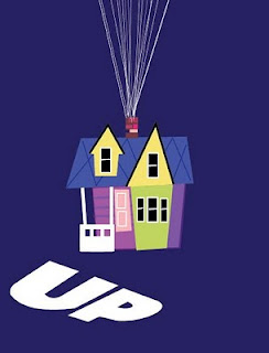
In my realization of how cool this idea was, I decided to take my turn at it. Originally I had grabbed my sketchbook and sat in front of my DVD collection to get inspired. I got to the computer and one thing led to another. I have a few favorites of the ones that I have completed, and others that I feel need more attention. However, for the sake of substance in this blog, I opted to post all the posters I completed one late night, not so long ago.
The trickiest part, I found, is to capture an entire movie in little detail. I took a lot of reference from the original posters or DVD covers and just simplified them further. Let me know what you think.